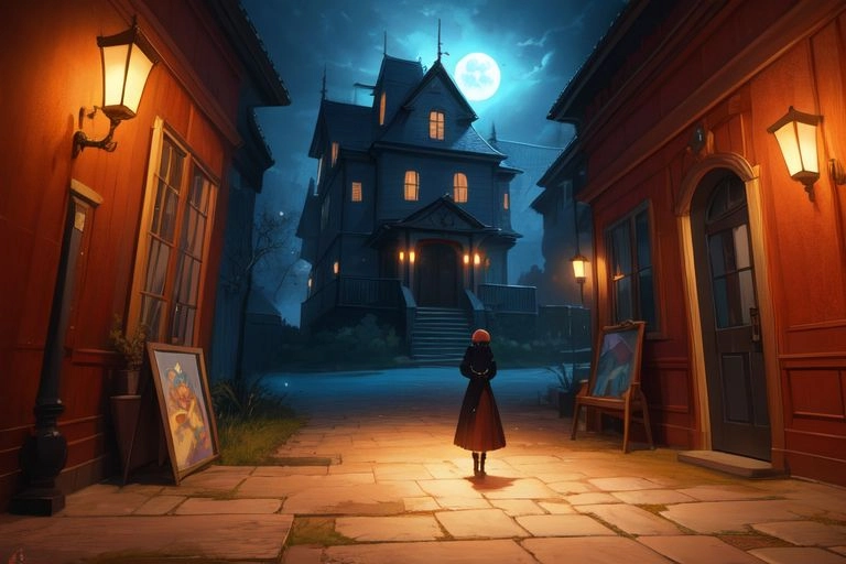
A Yokai Tale
Whispering Forest
import { ExpandableCard } from "@/components/ui/expandable-card"

export function ExpandableCardDemo() {
  return (
    <ExpandableCard
      title="Whispering Forest"
      src="https://cdn.badtz-ui.com/images/components/expandable-card/haunted-house.webp"
      description="A Yokai Tale"
      classNameExpanded="[&_h4]:text-black dark:[&_h4]:text-white [&_h4]:font-medium"
    >
      <h4>The Village's Secret</h4>
      <p>
        Deep within the mist-covered mountains of Japan, there lies a small,
        secluded village known as <i>Yamadori</i>. For centuries, the villagers
        have lived in harmony with nature, but they also harbor a dark secret—an
        ancient pact with the spirits of the forest, the
        <i>yokai</i>. These mischievous and often dangerous creatures roam the
        woods, unseen by most, but their presence is always felt in the eerie
        whispers that fill the night air.
      </p>
      <h4>The Mysterious Disappearances</h4>
      <p>
        Recently, strange occurrences have unsettled the peace of
        <i>Yamadori</i>. People have started to disappear without a trace,
        vanishing into the dense forest at night. Some say it is the work of the{" "}
        <i>yurei</i>, the vengeful spirits of those who died unjustly. Others
        whisper of the return of the fearsome <i>Tengu</i>, bird-like creatures
        that punish the prideful. The villagers, terrified, call upon a
        wandering priest, known as a <i>yamabushi</i>, to uncover the truth and
        appease the spirits.
      </p>
      <h4>The Encounter with the Kitsune</h4>
      <p>
        One night, while performing a sacred ritual, the <i>yamabushi</i>
        encounters a mysterious figure in the forest—a beautiful woman with
        fox-like features. She reveals herself to be a <i>kitsune</i>, a
        shapeshifting fox spirit. The <i>kitsune</i> warns the priest that the
        recent turmoil is a result of a broken promise made to the forest
        spirits long ago. Unless the villagers honor the pact, the wrath of the{" "}
        <i>yokai</i> will consume the village.
      </p>
      <h4>The Final Confrontation</h4>
      <p>
        With time running out, the <i>yamabushi</i> must uncover the forgotten
        history of Yamadori and restore balance between the human and spirit
        worlds. Guided by the <i>kitsune</i> and aided by the protective spirits
        of the forest, he ventures deep into the heart of the Whispering Forest
        to confront the malevolent forces that seek to destroy the village. In a
        climactic battle of wills, the fate of Yamadori hangs in the balance, as
        the <i>yamabushi</i> faces off against the vengeful spirits in a final
        effort to bring peace to both realms.
      </p>
    </ExpandableCard>
  )
}
Installation
pnpm dlx shadcn@latest add https://badtz-ui.com/r/expandable-card.json
Usage
import { ExpandableCard } from "@/components/ui/expandable-card";<ExpandableCard
title="Whispering Forest"
src="/images/components/expandable-card/haunted-house.webp"
description="A Yokai Tale"
>
{content}
</ExpandableCard>Props
ExpandableCard props.
| Prop | Type | Default |
|---|---|---|
title? | string | - |
src? | string | - |
description? | string | - |
children? | React.ReactNode | - |
className? | string | - |
classNameExpanded? | string | - |
[key: string]? | any | - |
Credits
This component is inspired by Linear.
Find customers before you even launch.
Reechlist finds people actively asking for what you're building.
Get My Free ScanOn This Page