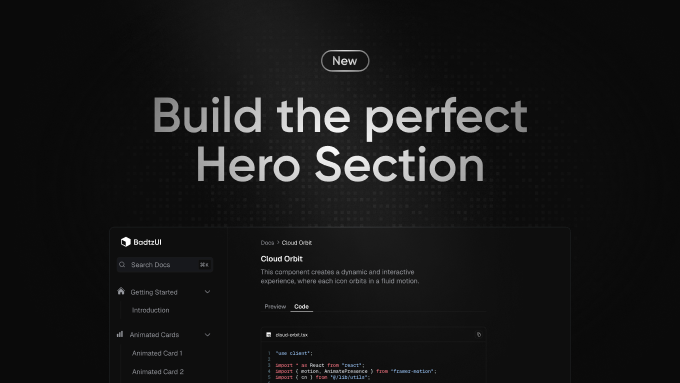
How to Create the Perfect Hero Section (Examples & UX Best Practices)
Learn how to design a high-converting Hero Section with clear headings, strong CTAs, and engaging visuals. Includes best practices and examples.
What is a Hero Section?
A Hero Section is the first visible part of a webpage, typically occupying the top section of a landing page or homepage.
It serves as the first impression and plays a crucial role in capturing the visitor’s attention.
A Hero Section should answer these key questions within 3 seconds:
- What is this website about?
- Why should I care?
- What should I do next?
A well-designed Hero Section can increase engagement, conversions, and retention rates by providing a clear message and a strong call-to-action.
The Importance of "Above the Fold"
The Above the Fold area refers to the part of a website that is visible without scrolling.
Since 80% of users never scroll beyond this section, it’s crucial to make an impact immediately.
Best Practices for Above the Fold UX:
- Keep it simple & clear → No overwhelming text or distractions.
- Strong visual hierarchy → The most important element should be instantly noticeable.
- Engaging CTA → The call-to-action should be visible without scrolling.
- Performance matters → A slow Hero Section = lost visitors.
Pro Tip: Google prioritizes fast-loading pages. Optimize images & avoid heavy animations in the Hero Section.
The Key Elements of a Perfect Hero Section
A great Hero Section consists of four essential components:
- A powerful heading (H1)
- A clear and concise description
- A strong call-to-action (CTA)
- High-quality visuals and layout
Let’s break down each element with best practices and common mistakes.
The Heading: Capturing Attention Instantly
The heading is the most crucial element of a Hero Section.
It should instantly communicate the core message of the page in 6-10 words max.
Best Practices for Hero Section Headings: - Keep it short and impactful. - Clearly state the benefit for the user. - Use power words to make it engaging. - Speak directly to your target audience (developers, designers, marketers, etc.).
Common Mistakes: - Too generic: "Welcome to Our Website" (doesn’t say anything valuable). - Too complex: "The Ultimate AI-Powered Solution for Revolutionary Business Growth" (too long and confusing). - No clear benefit: "We Build Digital Solutions" (lacks clarity).
💡 Good Examples: - "Boost Your Conversions with the Perfect UI Kit." - "Create Stunning Websites in Minutes, Not Hours." - "The Icon Library Designers Love – Beautiful, Scalable, Ready to Use."
The Description: Reinforcing Your Message
The description complements the heading by adding a short and engaging explanation.
The goal: Make it clear why your product/service is valuable.
Best Practices for a Strong Description: - Keep it concise (1-2 short sentences). - Focus on what the user gains. - Use simple, direct language.
Common Mistakes: - Too vague: "We create digital experiences." (Doesn’t explain how.) - Too long: A paragraph of text that overwhelms the user.
💡 Good Examples: - "BadtzUI helps you design stunning interfaces with ready-to-use components." - "Build high-converting landing pages with ease – no coding required."
The CTA: Driving Action Effectively
The Call-to-Action (CTA) guides the user to the next step.
It should be clear, visible, and compelling.
Best Practices for CTA Buttons: - Use a single, primary CTA → Too many options confuse users. - Action-oriented text → "Get Started", "Try for Free", "Download Now". - High contrast → The button should stand out visually. - Minimal friction → Reduce the number of required clicks.
Common Mistakes: - Weak CTA: "Learn More" (too vague, doesn’t encourage action). - Too many choices: Multiple buttons with conflicting CTAs. - Low visibility: CTA blends with the background.
💡 Good Examples: - "Start Your Free Trial Now" (clear and immediate action). - "Download the UI Kit – It’s Free!" (adds value to the CTA).
Pro Tip: Always prioritize a single, primary CTA.
Secondary CTAs (like "Learn More") should only be used if necessary and should never compete with the main action.
The Visuals: Enhancing User Experience
The hero image or background should reinforce the message and attract attention.
A Hero Section without visuals feels empty and unengaging.
Best Practices for Hero Section Images & Layouts: - Use high-quality, relevant images (avoid generic stock photos). - Align the visuals with the brand’s identity. - Add subtle animations for engagement. - Optimize images for fast loading speeds. - Show what the product does → Make it clear what users will get.
Common Mistakes: - Too cluttered: Too many elements competing for attention. - Low contrast: Text blends into the background. - Heavy images: Large files that slow down the page. - Unclear message: Images that don’t reflect the product or service.
💡 Good Examples: - A mockup of your product with a clean gradient background. - A lifestyle image showing real people using your service.
- A simple illustration that reinforces the message. - A screenshot or preview that clearly shows what the product does.
Pro Tip: Using a subtle parallax effect or animated gradient can make the Hero Section feel more dynamic without hurting performance.
Good vs Bad Hero Sections (Real Examples)
A well-optimized Hero Section immediately communicates value and drives action.
However, many websites fail due to poor design choices, unclear messaging, or weak CTAs.
Let’s compare successful vs ineffective Hero Sections.
Example 1: A Strong, High-Converting Hero Section

Why This Works: - Clear & compelling heading → Instantly communicates the benefit. - Short & engaging description → No fluff, straight to the point. - Strong CTA → Visible, high contrast, action-driven.
- Good visual hierarchy → The key elements (heading, CTA) are above the fold. - Optimized performance → No unnecessary distractions or heavy animations.
Example 2: A Weak & Ineffective Hero Section

Why This Fails:
- Generic, uninspiring heading → "Welcome to Our Website" doesn’t tell users what to expect.
- Descriptive paragraph lacks focus → The text does not get straight to the point.
- Low-contrast CTA → The button blends into the background.
Key Takeaways for a Perfect Hero Section
- Make it scannable → Users should understand your offer in 3 seconds.
- Prioritize CTA visibility → A hidden CTA = lost conversions.
- Use engaging, relevant visuals → The image should support the message, not distract from it.
- Keep text concise → No one reads long blocks of text above the fold.
Pro Tip: If you're unsure about your Hero Section, A/B test different variations and analyze which one performs best!
Elevate Your UI Game with Badtz UI Pro
Badtz UI Pro is a premium UI component library designed for developers and designers looking to build stunning, high-performance interfaces. It includes a collection of modern sections, pre-built layouts, and full-page templates, powered by React, TypeScript, and Tailwind CSS.
Why Choose Badtz UI Pro?
Pre-designed sections – hero sections, pricing tables, footers, and more
Optimized templates – create polished UIs effortlessly
Full customization – easily adapt styles to match your brand
Save development time – integrate high-quality UI elements instantly
Consistent & professional design – enhance your product credibility with a cohesive and polished user experience
With Badtz UI Pro, you can build beautiful and consistent interfaces faster than ever, focusing on quality and efficiency.
🚀 Ready to take your UI to the next level? Check out Badtz UI Pro today!
